Intro

Once upon a time, a girl woke up and thought she'd like to share her thoughts. At first, she felt lost, since she didn't know if all her thoughts can be shared. On her way to find her place in the internet world, she realised, she can publish whatever she loves, so here we go...
Showing posts with label Ideal Home. Show all posts

Tuesday, 18 March 2014

Ideal Home Show 2014

Thanks to complimentary ticket for the opening weekend of Ideal Home Show 2014, on Friday around lunch time, we were sitting in the train feeling excited and heading to the biggest home show located in Earls Court in London, where we were absorbing the atmosphere and visual information till sun went down. And now I can bring you fresh design news from my favourite two categories: interiors and garden. 

Let's start with the first stand we were attracted by:


Loftcat Home is furniture and home accessory boutique offering not only dining, bedroom and living room furniture but also rustic garden furniture and garden accessories. 


We were wowed by Singer coffee table and beautiful massive dining table, where the touch of polished surface and variety of wood patterns impressed us.


We also enjoyed stands of recreated room designs with a keen eye for detail. It's amazing how much thought designers have put into decoration of individual stands: the placement of small things like slippers under the bed, soap on the sink or kitchen towel hanged from stove handle. 


There were lots of suppliers presenting their products of different range and variety, from modern and luxurious sofas from Oliver Matthews, through amazing outdoor garden buildings from Breeze House (who attended also last year Ideal Home Show), to retro homeware or vintage interior accessories from East2Eden (which we loved the most. It was probably the most popular stand, its business didn't allow us to take any usable or presentable photos). 
From so many suppliers to chose from, we decided to lure you with Woolmark Interiors furniture design. The combination of leather and wool upholstery to recreated vintage style with breath of originality takes you back to old times when men were sitting in armchairs, drinking scotch on rocks and smoking large cigars. Beautiful!


When we finally found our way around and got familiarised with our surrounding full of stands, sellers and buyers, we found a minute to sit down, take a breath, absorb the atmosphere and to realise how huge the place actually is. It's amazing that organisers have had built several real houses in to showcase very different designs appealing to home owners of all age and taste categories. There was a main 'neighbourhood' The Prince's Crescent, which was showcasing three houses with 3 different interior schemes. 
The First house we visited carried name The Baillie-Scott Home. The aim of the design was to turn average family house into a unique space without compromising on practicality and needs of a family. If I can be honest, this house was least appealing to my eyes. There were too many colours, patterns, wallpapers, too much of everything and surprisingly, the overall design seemed to be boring. In conclusion, I wasn't well-impressed by the interior but I was actually able to find some uplifting points, such as some pieces of furniture (cupboard in dining room and one of the bedrooms), table lamps (not the pink shade) and the study room, my favourite room in the house and the only room with some continuity, colour balance and attractive simple design with only one eccentric accessory.


The second house on our list was The Family Home, four-bedroom house with high ceilings, big windows, with inviting interior created by using natural materials. The design was definitely more attractive since there weren't too colourful wallpapers screaming at you from the walls. Designers invested into natural, down-to-earth colours, such as duck egg blue, warm grey, beige or just a spoon of red to make it alive. It felt really homey and cozy and I could imagine a family actually living there; therefore, I'm definitely saving the supplier list of this one for one of my designs. 


One of my favourite houses was the last one of The Prince's Crescent, The Cottage. It really gave you the feeling that you're somewhere in the woods, relaxing by a crackling fire and drinking red wine. Unfortunately, the light inside was too dim and there were too many people, so I couldn't take as many picture as I'd wish. I can only recommend to go to see it yourself.


The last house on our list was the Multi-Generation Home styled by HouseBeautiful. The house was proof of well-balanced cooperation of traditional and modern design under one roof. You could see the hard work and the thorough thought behind the design. I loved almost everything about it. There was also variety of colours but it was rather concentrated on the rule '3 is enough for one room' and those 3 were well chosen and they played together wonderfully. 


The three houses brought to us by The Prince's Crescent were not the only built-in installations at the show, the originality of large installations was emphasised by an extraordinary tree home, designed by multi-awarded world leading luxury tree house and eco-home builders, Blue Forest Luxury Treehouses, in collaboration with John Lewis and Quiet Mark. 
The fully sound-proof tree house is made of Acoustiblock, which is made from 80% organic and recycled materials and offers sound insulation, and the interior is furnished with latest pieces from John Lewis. If you would like to see it/hear it in person, go to Ideal Home show that runs till 30th of March because then the installation will be donated and transported to the Chestnut Tree House Children's Hospice.


As I mentioned on the beginning of the post, I promised you news not only from interiors but also about garden design. And the show again fulfilled our expectations in this category and hasn't disappointed us at all. This year was follow-up of annual competition between young green talents of 6 leading colleges. Each college had to follow guidelines based on organic and sustainable principles set by the Prince's Foundation. Every visitor received a token to participate in voting for favourite and the most original garden design. 
We gave our votes to Capel Manor College because of their simple but impressive design with an inner oasis representation in background.


The design is based on geometric shapes and has been created to provide a stimulating and revitalizing retreat away from the demands of urban life.

The garden is based on the rejuvenation of the neglected ruins of Victorian pub, therefore the usage of recycled materials such as old bar or piano.
The theme of the garden is 'opposite attracts', therefore they've split the garden in two shapes: one side is predominately squares and the other is circles.

That's all from my contribution to this year Ideal Home Show. There is still much more to see; therefore, I highly recommend to invest your money into buying tickets and to attend this excellent show which has a lot to offer. 


Friday, 14 March 2014

Complimentary Ticket to Ideal Home Show 2014


I'm heading there today thanks to complimentary ticket from my favourite magazine Ideal Home and I'm very excited to bring you the latest news about design from Ideal Home Show experts. See you there (:

Check out their video from last year show: https://www.youtube.com/watch?v=iNGktMO5JIM


Saturday, 1 March 2014

Ideal Home: March Issue 2014

Boho-chic style: Love it OR Hate it? Bohemian style in fashion is one of my favourite styles, I cannot imagine my summer without floaty skirt, cowboy boots, french braids and headbands. It's a definite must for me! However, boho style in interior design is something totally different. It might be very down to earth style with natural colours and a swing bed of some kind in the corner. Or it's a combination of bright colours and all sort of patterns in one room. If it's done by unexperienced boho-chic designer or a total layman, it might end up very distasteful and tacky. Therefore, I haven't made up my mind about this style in this particular design field.
Anyway, if you are the person who seeks this free mind design in your room, Ideal Home magazine brings you some valuable tips.


Again, there was an article about a home make-over and I was very impressed by a particular one about a two-bedroom flat redesigned by an interior designer, Sooz Gordon. She's used bold colours mainly in decorations and accessories, which really pop-out in contrast with dramatic darker colours of paint on the wall. It's all well balanced, the contrast in the right amount and geometric patterns give her flat an interesting touch. You can feel the presence of the designer in the room and reason behind every picture or ornament put on the wall or the shelf.
Take an inspiration and try some dramatic and bold colours in your flat or house.


There was another redesigned rented flat, which I fell in love it straight away. It has everything I adore in interiors: traditional look, huge rooms, exposed beams, natural colours, window seat and of course originality. I'd probably use more colours and make the kitchen in more rustic style but that is all I would do differently.


And of course, you can find some great gardening tips in this issue regarding plant terrariums. We have tried them ourselves and satisfaction of the outcome is over the moon. And there is a very big advantage of small home terrariums: very low maintenance.

(All images are own by IdealHome magazine and are subjected to copyright matter.) (Presentation is my own and subjected to copyright matter.)

Saturday, 1 February 2014

Ideal Home: February Issue 2014

In this month issue I was mostly impressed by very bold interior design of a 4-bedroom Edwardian house from "Take the 60-second Tour" section. The owner of the house mixed bright colours of orange, red, yellow, green, blue, etc. Usually I skip right through designs of this kind of colour calibre because I'm not a big fan of too many colours in one room (in my opinion combination of too many bold colours usually causes rather a chaotic damage than a beautiful design). This time, I have really given a time to absorb those colours and I've found myself being a fond of this particular well-balanced colour mixture. Well, judge yourself if you like it:


Recently I've became a real marine lover. I love the navy blue colour, love the marine prints on textures, love blue and white stripe clothes, I just love it all. Therefore, there is no surprise I was really excited about "Make everything Shipshape" article. It covers a house turned into home celebrating marine moodboard. You can find there everything: from blue prints, industrial elements, lanterns, pictures of boats; it has it all.

Here, on this page, I was especially nicely surprised with image of my favourite joules wellies, which I used in my St. Nicholas poster. One day I'll have them in my possession (:

My last contribution to the magazine follows Colour School section, where their stylist works with Teal blues this time. I couldn't decide if I like it or don't. The combination of colours is great, I used it in one of my designs: teal blue goes perfectly with primrose-yellow, put there some beige or brown and you've got a nice colour palette. However, it might be easily overdone, as I think happened here:

The design has a potential but in my opinion it ended up looking like a section from Ikea. However, it's only about my personal taste and since I would give it like 3 stars out of 5, I decided to include it my post as some braver people might like it or even love it ;)

(All images are own by IdealHome magazine and are subjected to copyright matter.)
(Presentation is my own and subjected to copyright matter.)


Wednesday, 1 January 2014

Ideal Home: January 2014 issue

In the beginning of the magazine, there was an interview with "High Street Heroes" Mini Moderns Graphic Designers. The interview caught my eye straight away mainly because of very attractive featured images. The combination of Chalkhill Blue, Pale Verdigris and Mustard colour is an absolute excellent win for retro style designs. Their bold and beautiful patterns can really lighten up any interior. 


On the page 19 there is This month we love section and I have to agree with the love expression towards beautiful pieces from Cox and Cox. 


I'm starting to fall in love with white colour in interiors... It gives a chance to decorating pieces such as the artwork display or blankets of different colours really pop out.


Oak-framed house with exposed beams, white walls and rustic furniture... what's not to love?!


Buy similar bold wallpaper from Wallpaperdirect, Albany range, Albany Twilight 774795.


I just love this bedroom design. It's beautiful choice of wallpaper with gold pattern of flowers almost hidden in the paper sometimes sparkling under sun rays or getting darker in shadows of furniture, all in french style. 


Brilliant stylist Charlie Davis created amazing moodboard in sense of different shades of pale jade colour, which greatly teams up with different textures of wood or fabrics.

(All images are own by IdealHome magazine and are subjected to copyright matter.)
(Presentation is my own and subjected to copyright matter.)

Monday, 9 December 2013

Ideal Home: December Issue

The first thing, which interested me in this month issue, was a short attribution to an exclusive online members-only luxury lifestyle store Achica.com. The shop offers wide variety of luxury products from home furnishing to fashion accessories in up to 70% discounts with promotions that last for 48 hours. 


The article promotes the layering of different textures: (quote) from crisp cotton bed or table linen to fine-gauge wool blankets and chunky, woven throws and rugs. (And don't forget) basketware, leather pieces and wood finishes.


From the Take The 60-Second Tour passage of the magazine, I like the most a five-bedroom, Georgian, detached farmhouse with Scandi Interior.


The country style furniture used in the design is amazing, one of my favourite is the sofa with almost matching coffee table. For a similar sofa, IdealHome suggests to try Gloucester, £1,400, Laura Ashley.


This month issue again offers some great moodboards with Christmas theme in mind. Gorgeous Woods & Leaves Moodboard offers great ideas of using natural resources to gain magical cosy home.


There's of course something for talented craft-loving peeps as me: 4 different ideas of candle design.


And on the end, an (passé) advert of Ideal Christmas show.


For my great sadness, I couldn't attend this year show, which was surely an amazing opening of festive season, but it did remind me of my visit of 2011 Christmas show, which was at least half amazing as this one. Therefore, I'd like to share at least the old news and, in my humble opinion, what's old it's even better for Christmas theme :)


(All images are own by IdealHome magazine and are subjected to copyright matter.)
(Presentation is my own and subjected to copyright matter.)


Front Entrance


Snow Wonderland, You'd feel like in a forest
Garden Wooden Gazebos with christmas table decoration
An amazing interior products designer Melanie Porter.
Christmas-smelling decorations
Even I bought something little: a beautiful scarf and a little present for my niece.
(All photographs are my own and are subjected to copyright matter.)

Friday, 1 November 2013

Ideal Home: November Issue

I'm little late with November issue, so I apologise for that. We've had a lot of visitors over past couple of weeks what has put me little bit behind with my work. Well, enough of excuses, let's present you what has interested me in this month issue!


I love the front page image of a traditional rustic lounge, so I went straight to page 28 where I could read more about it. The moodboard is called Woodland Chic and it's combination of natural material such as wood with natural colour palette of nude, pastel blue and beige. 


The wallcovering is from Sanderson, Squirrel and Dove, £45 per roll. It's a great representation of a forest world and it suits very well with overall design; however, it might be a little too expensive. Here comes perfect Ideal vs Great Deal column where Ideal Home magazine always prepares some cheaper alternatives affordable for everyone, which are very close to the original styles. In this case, they suggested a little bit more modern look, a Trees and Birds wallpaper from Homebase for only £9,99 per roll.


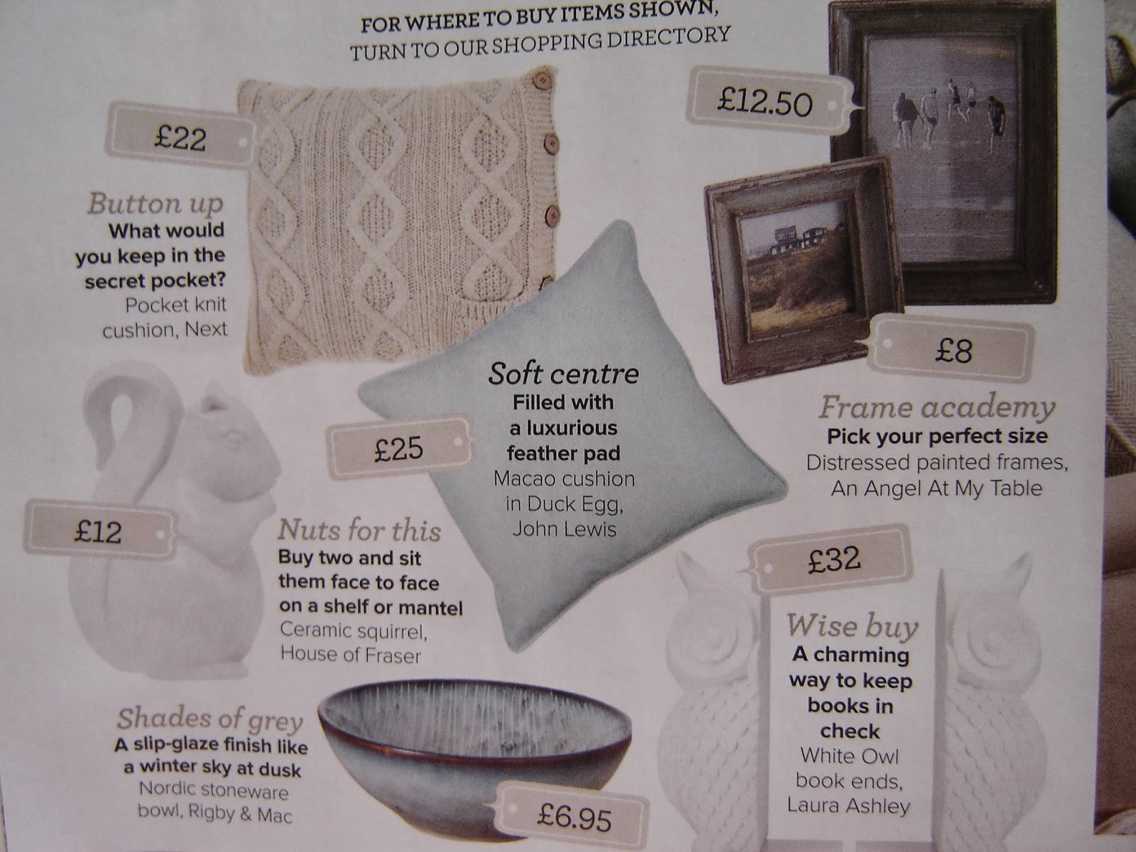
Here are some examples of beautiful and cosy decoration ideas from soft pillows to charming Owl book ends.


The overall look
On page 37, I've found a very nice and warm design of a breakfast room within a Victorian villa. 


Here are some examples of furniture style I adore. The image on the left shows a green John Lewis armchair inspired by 50's or 60's designs what reminds me of my grandparents furniture and it brings back some warm memories. I definitely have to get one of these for my house one day! 

The image on the right side: (quote) Mix of classic British furniture and fabrics with offbeat contemporary details. I don't think anything else needs to be added, it's just a perfect balance in design.


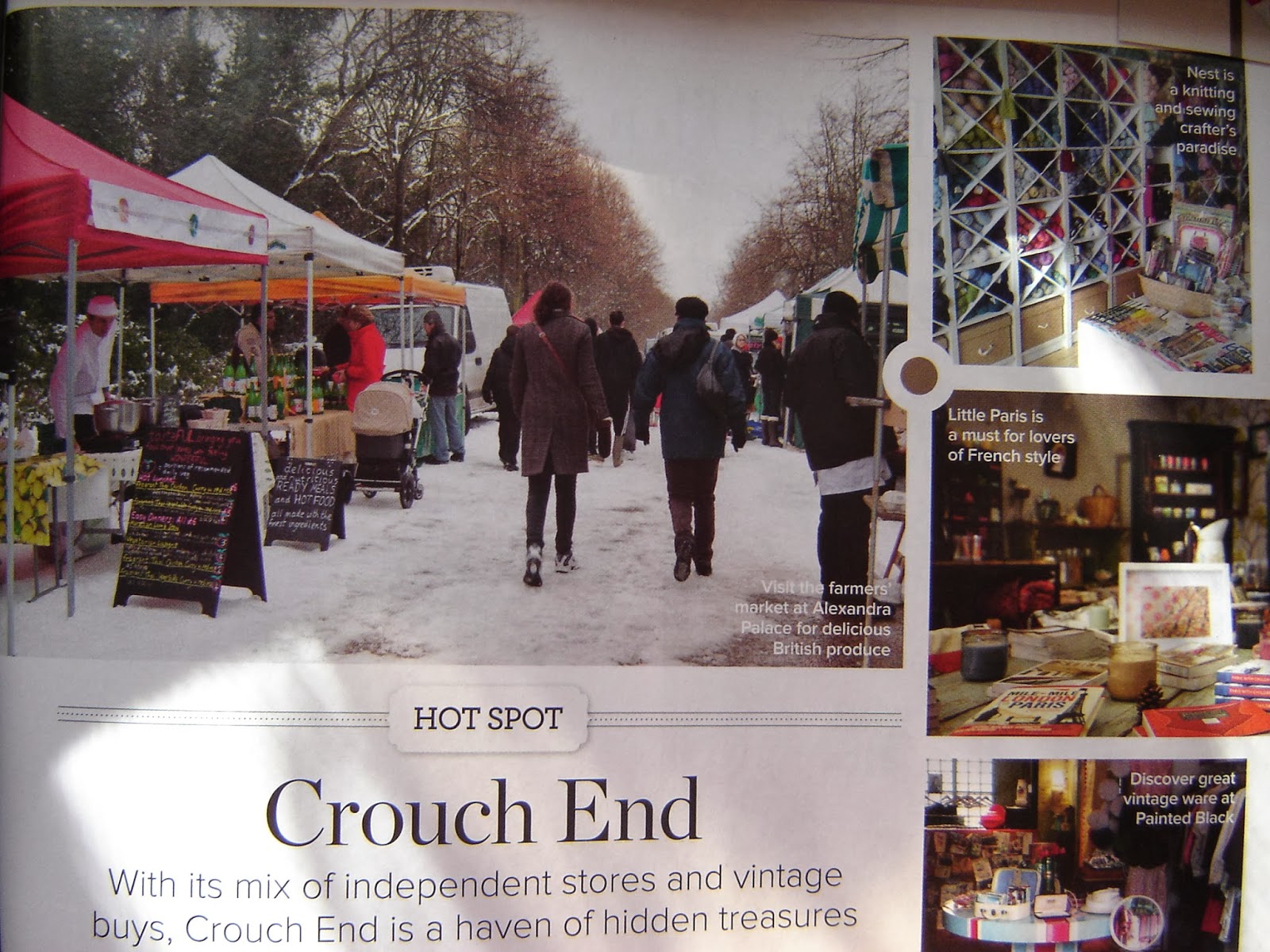
Getting to the end of the magazine, there is a great Hot Spot suggestion: Crouch End, a haven of hidden treasures. There are a lot of little shops or outside market, where you can find some very original and vintage treasures for your home. Go, have a look and let me know, what you find there (:


On the end, I decided to include as well some marketing adverts of products I find attractive: Dibor, iron french style, and Dobbies, garden centres.


(All images are own by IdealHome magazine and are subjected to copyright matter.)
(Presentation is my own and subjected to copyright matter.)


ShareThis

Related Posts Plugin for WordPress, Blogger...